INSIGHT
A Sensory State
The converse effect of excess screen time has consumers craving heightened sensory stimulation from brands. We head to New York to discover brand experiences that excite and delight us
Warby Parker’s first bricks and mortar store in SoHo is a stunning mid-century library inspired space. Expanding from an online optical brand to a multichannel offering, they took cues from the spacious Apple store nearby. Armchairs, long central tables and built-in technology like fun instagram filters, provide a relaxed interactive experience. We were drawn to the retro style eye appointments board with rosewood detailing and loved the library ladders with carefully curated colour coordinated books, also on sale. Unbeknownst to most, hidden sensors gather data about the number of glasses customers try on and who walks in with a smartphone.
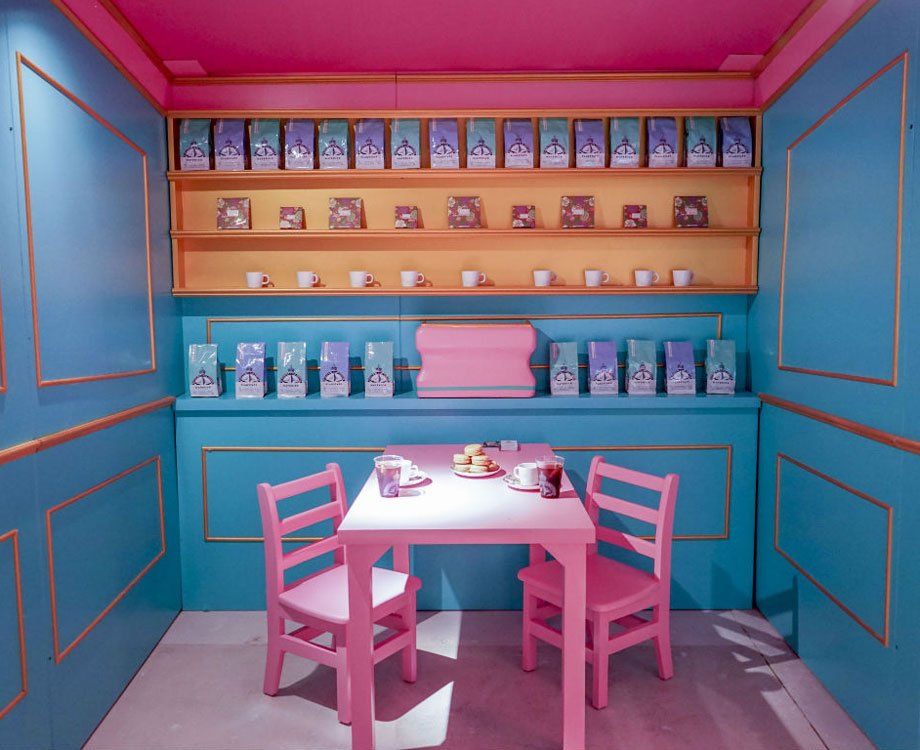
Next stop Winky Lux Experience pop-up, an explosion of flowers described as an ‘instagrammable makeup playground’ has been disrupting cosmetic retailing norms. You can try on products in 7 themed settings such as a miniature coffee shop and a nap room. Although tight on space, we felt the vivid colours worked better on photos and the $10 entrance fee claimable against products guaranteed that you left with at least a matcha lip balm. Whilst aimed at millennials, it was interesting to note the wide mix of ages.
It’s hard to describe the William and Guild flagship. A homeware showroom, restaurant, bookstore - a sensory experience? We immersed ourselves in their dream home and learnt how multifunctional space can successfully draw you in to discover and delight. Entering through the La Mercerie Café with a bakery and a wildflower shop to one side, we walked seamlessly into homeware where you can buy the furniture and table settings used in the restaurant. With moody blues and rustic tones it was easy to see the inspiration - an oasis you want to linger in and return to.
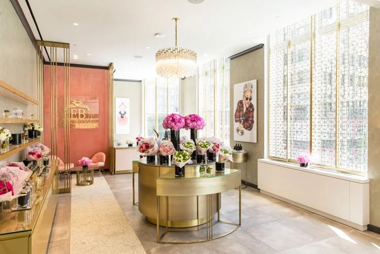
The Saks Fifth Avenue concept on the 2nd floor was truly a one-stop beauty mecca. The emphasis shifted from product focus to experience with 15 spa rooms, an event space and services ranging from personalised perfumes to facial workouts. We loved the large open windows evoking a feeling of space and the clear signage making it easy to navigate and explore.
©Saks Fifth Avenue - Justin Bridges
We booked an afternoon nap session online at The Dreamery by Casper. We admired the subtle, smart collaborations and product placements such as bespoke pyjamas from Sleepy Jones and sample toiletries from Sunday Riley. After the excitement and bustle of NYC, the quiet hum of white noise and the subtle grid ceiling lights evoking a starry night was a welcome respite. The floor to ceiling feature glass wall had a soothing effect and the sleeping pods were so comfortable that the staff struggled to wake one of us after 45 minutes.
New York does modern nostalgia well and it’s clearly evident in the southern Italian inspired restaurant Scampi. The double height bar area and communal seating leads into an intimate space with portholes into the kitchen. We also loved the geometric lighting and curved mirrors. Along with the scattered planting throughout, it follows the current trend of approachable living spaces to savour and indulge in.
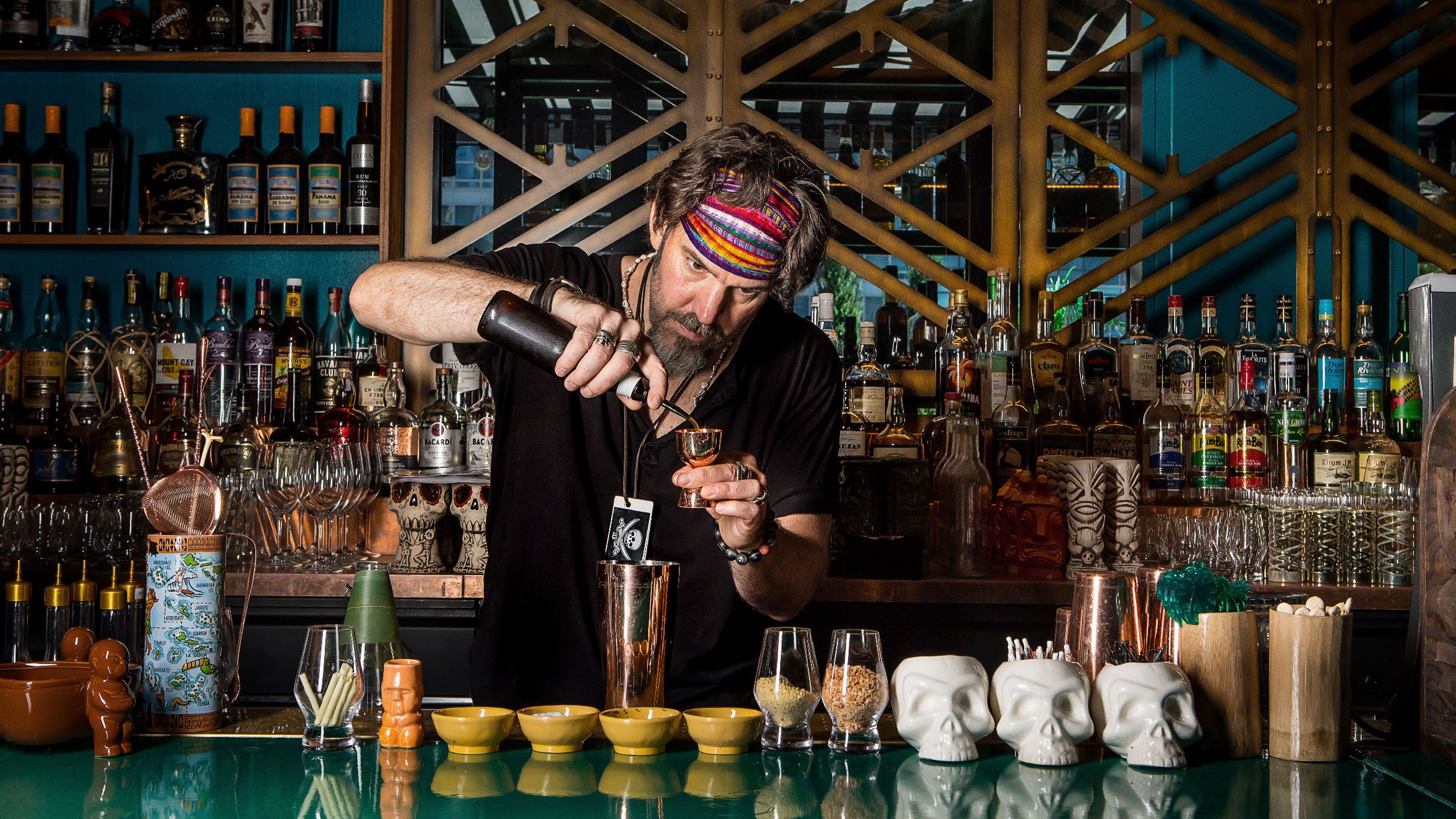
For the ultimate cocktail theatre, we went to The Polynesian, where every detail was designed to plunge us into the tropics - from carved Hawaiian woodcraft, to waves of turquoise, to the giant plants. Staff trained in Polynesian culture made ordering cocktails such as Humuhumunukunukuapua’a, a 360 immersive adventure.
©The Eater
A pleasant surprise was the food halls, both in the malls and transport hubs, such as the renovated Grand Central Station. Rather than traditional food chains, we found local popups, cocktail bars and even salads grown onsite, turning them into desirable foodie destinations. Highlights include the updated Campbell Bar, with its original art deco architecture and a new striking green quartzite bar, taking us back to the opulence of the 30’s.
©The Campbell
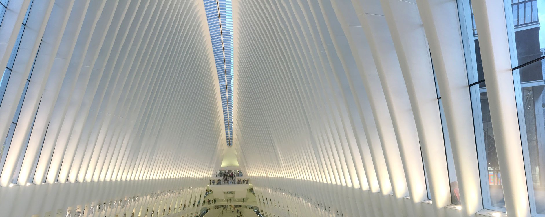
We obviously had to visit The Oculus, Westfield World Trade Centre designed by Spanish architect Calatrava as a tribute to the victims of 9/11, represents a white dove being released into the sky. As NYC is famous for its high-rise architecture, we felt this monument was a thought provoking pause point. The mall is also different as it doesn’t have an anchor brand, instead the design of the grand hall is perfect for events, such as live music and organic markets, enhancing the space for living and experiencing.
In a city that personifies digital overload, relaxation has become aspirational and experience has become multi-sensory. Successful brands are not only providing instagram-primed social hubs for personal stories, but also appealing to consumers’ smell, taste and sound and using them to trigger long-term memories.
Our visit to NYC certainly highlighted how the most commercially dominant brands will embrace sensory innovations and engagement, fostering strong perceptions that expose our most intimate selves. ‘Brands that appeal to more than three senses can increase brand impact by 70%’ – a commercial opportunity not to be missed.
How can we stimulate sensory emotions for your brand?


