INSIGHT
Bold and Beautiful: Milan’s Iconic Style
Why choose neutral when you can go bold and beautiful? This capital of fashion shines with confident design, loud brand personalities and unique details. We have picked out five of our favourite places that we visited during our recent trip. Each demonstrates distinctive, destination brand experiences powered by a singular brand vision.
“Milan is a true metropolis: strong and fearless but welcoming, too.”
Antonia
This is the latest Antonia store inside Portrait Milano, a new lifestyle destination, in a former 16th century seminary built around a beautiful 2,800 square metre courtyard. The interiors of both the men’s and women’s multi brand stores, unapologetically reference the scale and grandeur of architecture of the colonnade with seven metre ceilings and pillars which help to define the space, just stopping short of the celling. The industrial feeling contrasts with polished, glossy elements, together with mid floor focal points, to create a genuine sense of discovery, and creates a desire to further explore the edit of up and coming designers with more established names. The experience of visiting and having a coffee overlooking the vast courtyard, away from the frenzy of the street is something truly special.
La Double J in Via Sant’ Andrea the only brand store to date, apart from the just opened second store in Taormina, will be a must stop off from visitors on their white lotus pilgrimages this summer. Launched as a ‘shoppable’ magazine in 2015 the unstoppable, irrepressible maximalist spirit of JJ Martin has created a truly unique lifestyle brand, where the joyful vintage prints are applied on everything from swimwear, dog baskets, desirable dresses to covetable homeware. Collaboration is part of the essence of the brand, with the Milan store being the result of a collaborative collective combining stunning vintage pieces such as the antique bar cash desk and the hand painted floor that recreates one of the brand’s signature prints. Although the brand has pop ups with selected stores, ‘pet us in person’, being in their store is a truly, to use one of their words a truly ‘zing-tastic’ experience.
Casa D&G
Well, what can one say, in a brand whose maximalist DNA is in a league of its own, the Corso Venezia store celebrates the enduring appeal of the house’s 4 iconic prints, Mediterranean Blue, Zebra, Leo, and Carretto, sing out in a space which is deliberately neutral in black, white and grey to ensure the prints take centre stage.
Corso Como, an enduring favourite, seems to be now equally balanced between hospitality and store, which works beautifully well, in giving an opportunity to dwell and enjoy the space, as an exquisite sanctuary and haven from the outside world. The store remains as magical as ever, with the iconic Corso Como icon used in a variety of creative, expressive ways to define and separate individual areas. Cleverly heroing the exquisite brand packaging in artful destination displays enhances the appetite to buy something, anything, just to have a piece of this wonderfully enduring Milanese institution.
Mitu, an amazing find, wonderful food, in a rich atmosphere, with an abundant layering of artisanal pieces such hand painted ceramic and beautiful masks executed in an elevated, sophisticated, but authentic, fashion, with beautiful attention to detail, rather like the food, in fact. The name of a small Columbian town, Mitu is a gateway to the Amazon rainforest, and the first fine dining Columbian restaurant in Italy. The vision of 4 friends was to create a space, where the country’s rich cultural heritage and hospitality could be experienced. The transformation of a former warehouse into a tropical design paradise, in the words of the architect has been fully realised in this must visit restaurant.
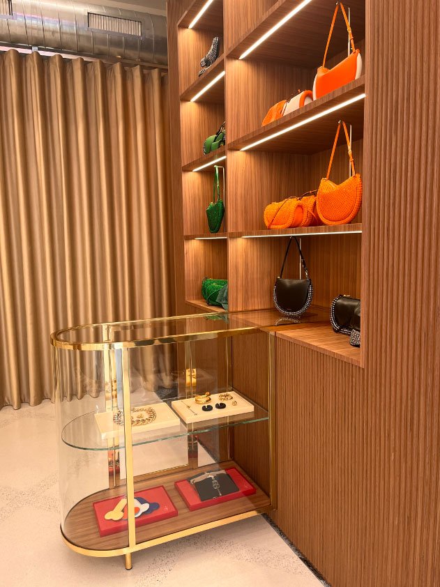
JW Anderson’s new store in Milan was a delightful surprise with an innovative approach to space layout through changes in floor patterns and an imaginative use of architectural cues such as the steps at the entrance for display. Referencing both its heritage from Soho, London and Italian materials such as terrazzo, the store was small yet there was a journey of discovery around each corner. A clear emphasis was given to showcasing art as well as products which immediately inspires and gives an insight into the brand stories and influences.
“It’s an extension of the brand within a physical space and it’s a nice window into a brand. It allows people to engage on a different level.”


