
Everyday healthy living
HEALF
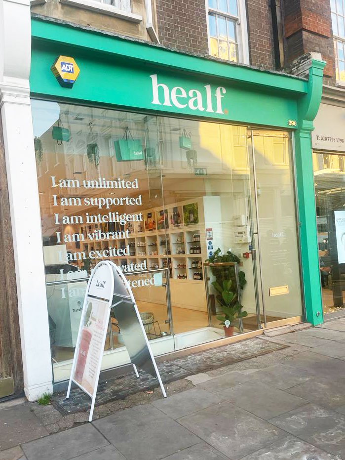
A new strategic framework and visual expression is achieving an energising re-branding of The Healthy Living Store to Healf.
Healf is all about realistic, everyday wellness: a very different ethos to the goal-driven orientation that epitomises this landscape. Products are carefully curated by the founding brothers, providing a one-stop shop for simple, daily remedies and rituals that go towards lifelong health.


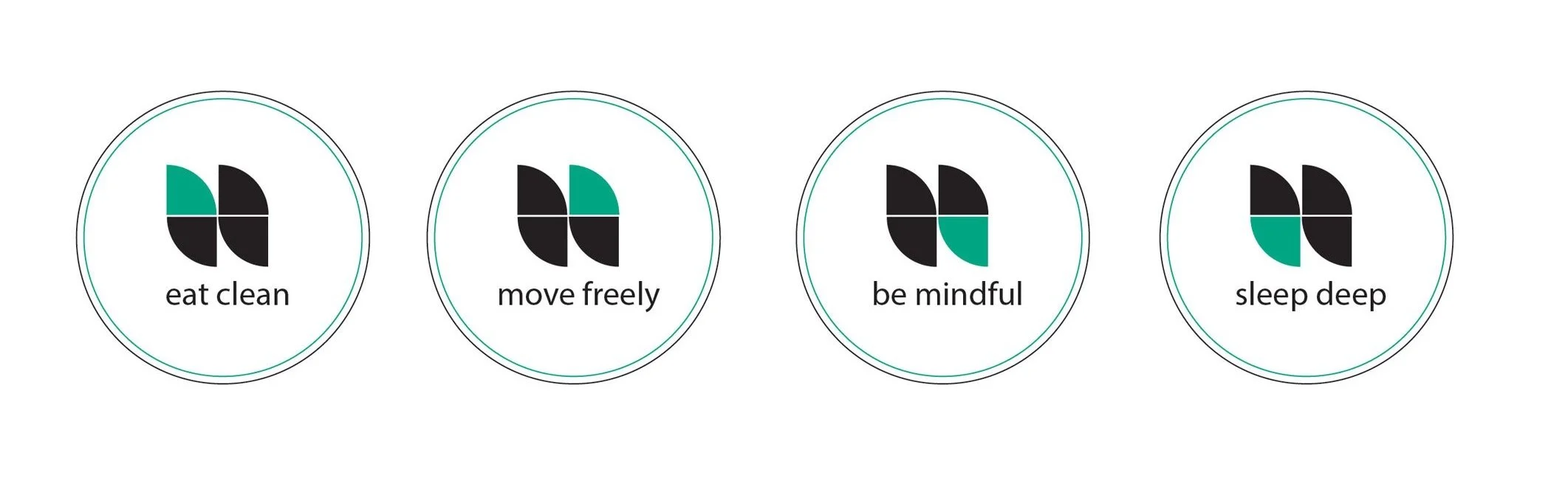
The brand is about authenticity and truthfulness, creating trust and heartfelt connections with customers. So its visual identity and signature are strong and simple; bold yet friendly. A no-nonsense graphic full stop underpins the circular rhythm at the heart of the brand, representing the four intertwining pillars of sleep, move, eat and mind.


No-one is perfect all the time; Healf helps everyone find a little more balance a little more of the time … a very welcome and calming antidote to our pressured environment.

“The reason we chose Caulder Moore was that the care, attention and passion that went into every interaction made us certain that our brand would be safe in their hands.
The team went above and beyond to provide an exceptionally personal level of service, which we felt was important to bring our vision to life.
They went to great lengths to truly understand who we are - talking to staff, investors, researching the industry and market - to make sure that the end result delivered a brand to last a lifetime. Which it does!”